December 31, 2019
Card Sorting - The UX Tool I Used to Win My First Design Challenge on Topcoder

When people face new situations they may find it hard to cope with them. I believe that to improve, one has to jump into new, most of the time uncertain, tasks even when it is a bit scary. This is also the case with being a beginner designer on Topcoder. Many new members find it hard to come to a breakthrough point when they actually start to win.
If I were to give the beginner designer one piece of advice - besides never give up - it would be, keep on learning every day. Most design tools are actually not that hard to learn and use, but can help you a lot in understanding what you have to do to succeed. In this article, as the title suggests, I would like to show you the UX tool I used in the first challenge I won on Topcoder; the so-called card sorting.
Objectives
Card sorting is a tool from the information architecture (IA) toolbox. IA is a design discipline that aims to create a more usable structure for the product the designer is working on, making it easily discoverable and understandable. For instance, if the information architecture is done right, the structure of the content of a website matches the visitor’s mental model. As a result, navigating that website is intuitive and the visitor will know exactly which links to click to find what he is looking for.
The advantages of card sorting
Performing card sorting is cheap as you only have to use paper and pen.
It is a quick way to gather ideas and sort them fast.
It is an easy way to create good information architecture and meaningful navigation structure.
It is a compact way of laying down new ideas and solutions to concept problems.
It helps you identify logical and organizational flaws.
By using it you can improve the overall user experience of the product you are working on.
How to perform card sorting
Let’s see how card sorting works, and how you can apply it for Topcoder design challenges. As an example I will use the process I followed for the first challenge I won, which was about how to improve the Topcoder member profile settings. The member profile settings include a lot of information about us. In the challenge specification, we got some ideas about what the team thought would be useful to include. This is where I started my process and chose card sorting as my partner in crime.
Firstly, I did some brainstorming based on the information in the challenge specification. I listed every bit of information/functions the team suggested and added everything I thought would be useful to know about members at some point (e.g. mobile provider or internet provider subscriptions). At the brainstorming phase, you shouldn’t judge the ideas. Even the nonsense ones could trigger useful ones.
Secondly, I created my cards, which means that you have to write each piece of information on a piece of paper. Sticky notes work well for this purpose, though my process was more digital, so I printed out and sliced my cards into bits. The first two steps in an average project would be done by the designer.
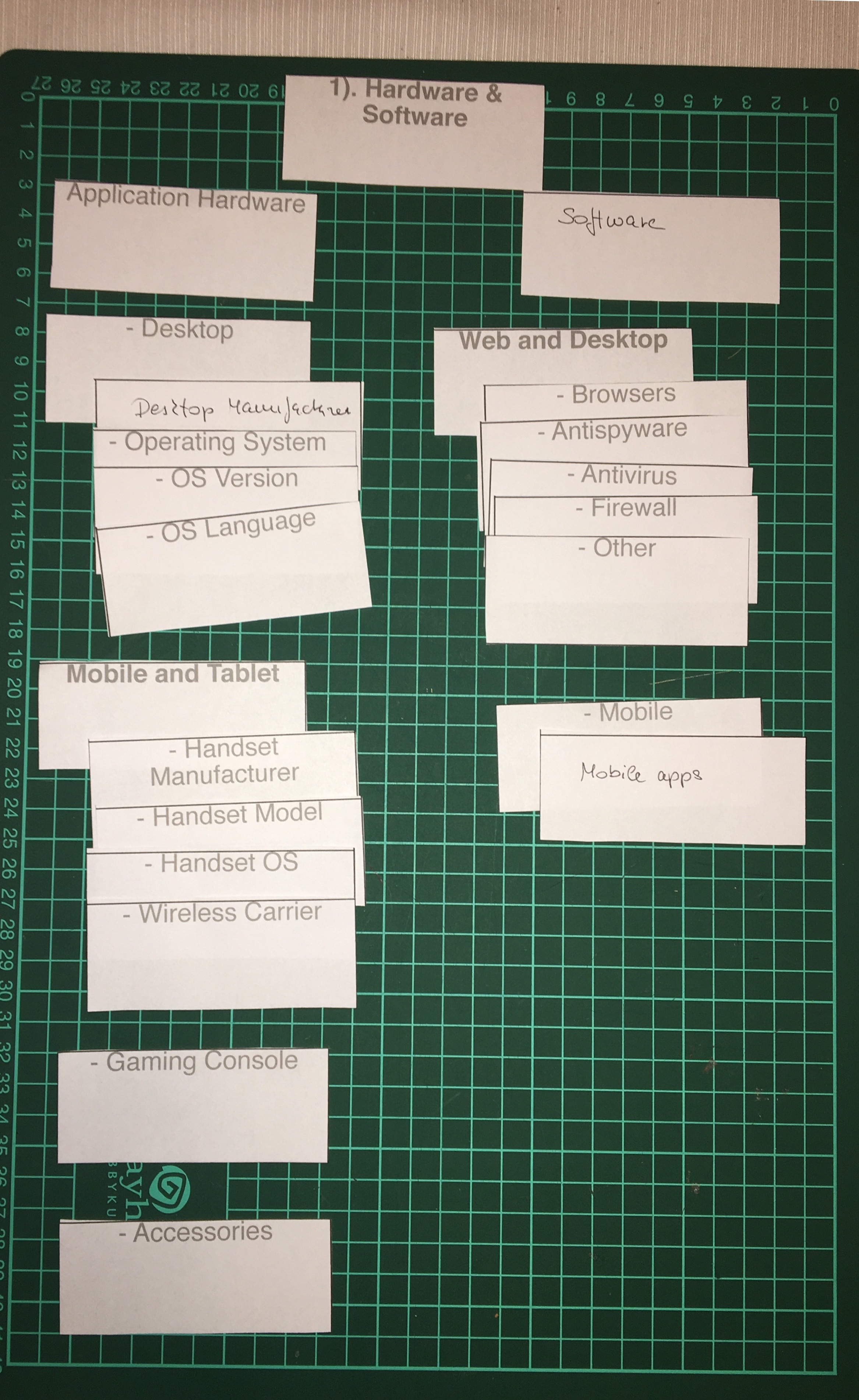
Then I took my cards and started to arrange them into meaningful groups, like hardware & software, education, etc. The cards can go to different levels, so I identified further subgroups and entities included within those. In an ordinary project, where you have a chance to work with users this would be done by the users. For the challenge, I took this role, as besides being a designer, I am also a Topcoder member, the intended user.

This is just a part of my arranged cards for the Hardware & Software section of the profile
When I had all the cards arranged, I used the structure I got when I went on to design my screens. I based the navigation on it, and also made sure that the subgroups I created were arranged at the right navigation level under the adequate group.
What you can use card sorting for in Topcoder design challenges?
Firstly, as shown in the above example, you can arrange functionalities into a great, meaningful navigation structure. In many challenges, especially in concept ones, we get a green light to come up with our own ideas instead of basing our submissions on wireframes the client provides. In these cases, card sorting can be useful to create a clear vision of your submission’s structure.
Secondly, when you are asked to arrange the information of entities in a system (e.g. think of the contact cards for users), you can also gather your ideas on cards and play around with them on your desk, instead of drawing them first.
Isn’t it as easy as 1, 2, 3? Like with many UX tools the main advantage of card sorting is that you can identify logical or organizational glitches early in the process. So, the worst thing that can happen would be tossing your sticky notes, that took 2-6 seconds to prepare compared to a considerably larger amount of time you spent on designing screens and than have to delete them.